Visualizing Meta-Analysis: Advanced plots and interactive tools

Meta-analysis is a statistical method that combines data from multiple studies to provide a clear answer to a research question. It plays a crucial role in evidence synthesis by summarizing diverse findings, strengthening conclusions, and guiding policy or practice decisions based on comprehensive data. Thus, visualizing such data in the form of graphs and charts improves understanding by simplifying complex results, highlighting key findings, and allowing for easier comparisons.
Visualizing Meta-Analysis Data
In meta-analyses of clinical trials, various plots aid in visualization. Visual tools like forest plots are invaluable in showcasing the range of effect sizes across different studies. Similarly, funnel plots detect publication bias by highlighting underrepresented smaller or negative-result studies. Whereas, cumulative meta-analysis plots reveal trends, showing how pooled estimates improve with additional studies.
Further, these visual aids make complex data more digestible and highlight critical patterns and inconsistencies for accurate interpretation. Additionally, effective data visualization supports better decision-making across industries. Therefore, exploring newer graph types in meta-analysis can enhance data interpretation by offering deeper visual insights.
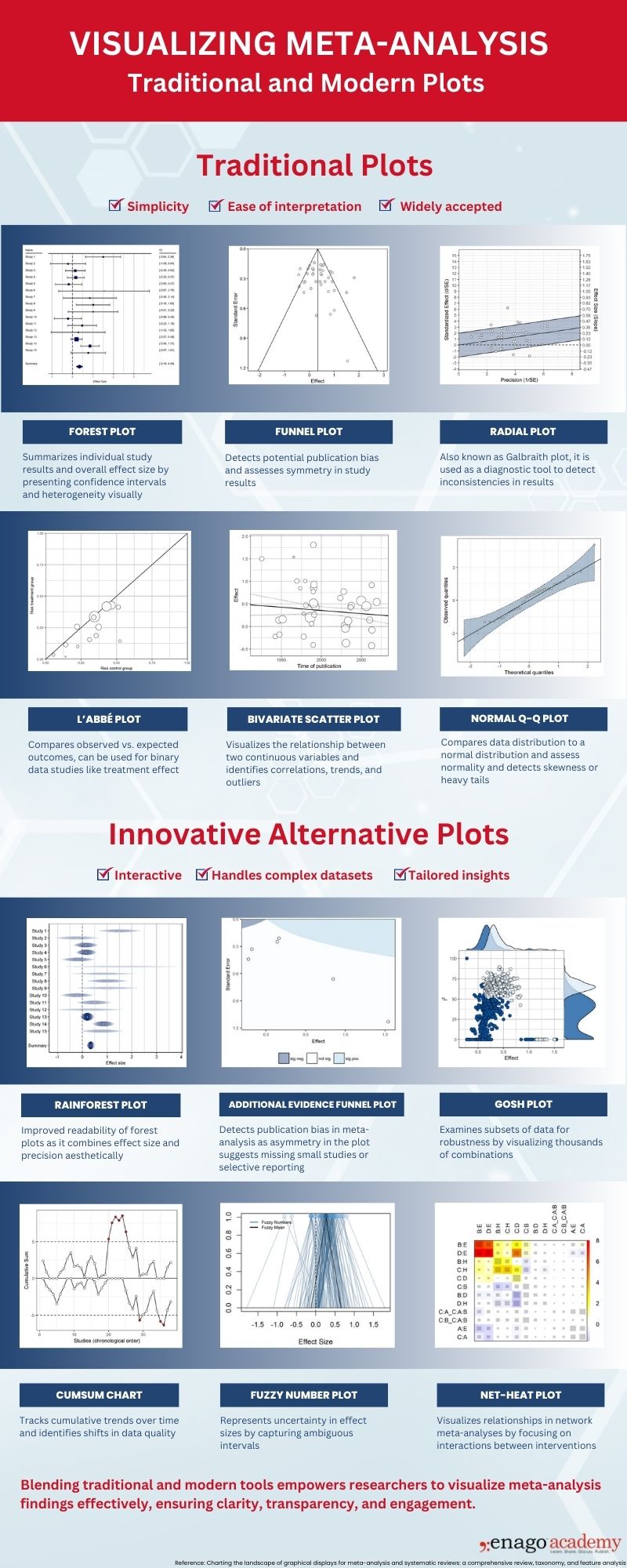
This infographic provides a comprehensive overview of the purposes served by both traditional and innovative graphs in meta-analysis.

Let’s dive deeper into these advanced plot types to understand their unique features, practical applications, and how they enhance meta-analytic data interpretation beyond traditional methods.
Advanced Meta-Analysis Plots
1. Rainforest Plot
A rainforest plot is an enhanced version of the forest plot. It combines effect sizes, confidence intervals, and study weights with subgroup analyses. It also provides a detailed representation of study contributions making it easier to explore subgroup trends and the relative importance of each study.
2. Additional Evidence Funnel Plot
The additional evidence funnel plot builds on the traditional funnel plot by incorporating external variables to address asymmetry. This plot is useful for assessing publication bias, selective reporting, and robustness of meta-analytic conclusions.
3. GOSH Plot
The GOSH plot visualizes heterogeneity by presenting all possible subsets of study effect sizes. Therefore, it reveals patterns, outliers, and clusters within subsets. It also offers a comprehensive view of how individual studies influence the overall effect.
4. CUMSUM Plot
The CUMSUM (Cumulative Sum) plot tracks the cumulative effect size estimate as studies are sequentially added to the meta-analysis. It is particularly effective in identifying trends over time or stability in effect sizes. Additionally, it can be used to determine when additional studies no longer significantly alter conclusions.
5. Fuzzy Number Plot
The fuzzy number plot represents data with inherent uncertainty by displaying intervals or ranges for each effect size instead of single point estimates. This plot is valuable in scenarios with ambiguous or imprecise data and provides a clearer understanding of variability and confidence.
6. Net-Heat Plot
The net-heat plot is designed for network meta-analysis, visualizing the contribution of individual studies to the network’s overall relationships and inconsistencies. It highlights influential studies and connections. It also aids in pinpointing areas of potential bias or inconsistency within the network.
Furthermore, it’s essential to understand the best practices for each plot to enhance data interpretation.
Grab our FREE DOWNLOADABLE to learn more about the applications and best practices to consider when using each of these plots.
Static visuals, while useful in conveying basic information, have several limitations. For instance, they lack interactivity, which means viewers cannot explore the data in depth or focus on specific elements that are most relevant to their needs. Moreover, they may not adapt well to complex datasets, making it difficult to represent multi-dimensional relationships or intricate patterns effectively.
Therefore, relying solely on static visuals limits our ability to extract deeper insights, especially in meta-analyses involving large, multidimensional datasets.
Interactive Visualization Tools
As the complexity of data continues to grow, traditional data visualization while essential, is no longer sufficient on its own.
The tools we use to represent such complex data have thus evolved. Interactive visualization tools have created an opportunity to engage with data in real-time, uncover intricate patterns, and customize views for more tailored insights. Let’s explore two popular interactive data visualization tools.
1. Shiny Apps
Shiny apps allow users to interact with the data by adjusting parameters and instantly visualizing changes. This supports a dynamic and user-driven exploration of the data.
-
Dynamic Adjustments:
Users can interact with data in real-time by modifying parameters and instantly viewing updated visualizations.
-
User-Friendly Interface:
It is designed for non-technical users and can simplify data exploration through sliders, dropdowns, and other interactive elements.
-
Custom Dashboards:
It also allows the creation of dashboards to combine multiple visualizations to get a comprehensive overview.
-
Web-Based Accessibility:
Visualizations can be hosted online, improving accessibility, and overcoming the need for specialized software.
-
Data Exploration:
Effective in exploring meta-analytic trends, subgroup analyses, and cumulative effects.
2. D3.js
D3.js enables the creation of highly customizable and interactive visualizations that can handle large datasets. It provides users with control over aspects like filtering and zooming.
-
Highly Customizable Visuals:
Unparalleled flexibility in designing interactive and visually appealing charts, graphs, and maps.
-
Handles Complex Data:
Ideal for multi-dimensional datasets. It allows for features like zooming, panning, and filtering.
- Integration with Web Technologies:
Seamlessly integrates with HTML, CSS, and JavaScript to enable web-based interactive visualizations.
-
Rich Animation Capabilities:
Supports animations to show changes in data or emphasize key findings dynamically.
-
Technical Expertise Required:
Best suited for users with programming skills to unlock its full potential for customized data representation.
These distinctions emphasize how each tool uniquely contributes to advancing meta-analysis visualizations, catering to different user needs and technical proficiencies.
Blending traditional and interactive visualizations is the key to advancing meta-analysis data representation. Traditional graphs remain valuable for summarizing key results, but interactive tools offer dynamic and real-time engagement. Therefore, using them in combination can enhance transparency, accessibility, and decision-making. Thus, empowering researchers and stakeholders with comprehensive, impactful results for evidence synthesis.


