Graphical Abstracts Vs. Infographics: Best practices for using visual illustrations for increased research impact


Dr. Sarah Chen stared at her computer screen, her eyes staring at her recently published paper and the journal’s new requirement: a graphical abstract. As a seasoned biochemist, Sarah was no stranger to complex data visualization, but this felt different. She couldn’t help but wonder, “How do I distill years of research into a single image?”
Meanwhile, across campus, Dr. Mark was grappling with a similar challenge. His department had tasked him with creating an infographic to showcase their latest findings on climate change. “How do I make this accessible to the public without oversimplifying?” he wondered.
Sarah and Mark’s dilemmas reflect a growing trend in the scientific community – the rise of visual communication tools like Graphical Abstracts (GAs) and Infographics. But what exactly are these tools, and how do they differ?
Defining Graphical Abstracts and Infographics
While both GAs and infographics serve to communicate complex information visually, they have distinct characteristics and purposes. GAs are visual or pictorial representation of the key findings of a research paper or an article. It summarizes the main results of a study in a concise and coherent format. Infographics, on the other hand, are visual representations of information, data, or knowledge intended to present complex information clearly. They provide an easily digestible overview of a topic.
Difference Between Graphical Abstracts and Infographics
To understand the differences between GAs and Infographics, let’s look at a comparison table:
Feature |
Graphical Abstract |
Infographic |
| Format | Single image or figure | Can be multi-panel or scrolling |
| Content | Focused on main findings of a single study | Can cover multiple aspects of a topic or multiple studies |
| Research representation | Directly represents specific research findings | May synthesize information from various sources |
| Text usage | Minimal text, often just labels | More text, including brief explanations |
| Audience | Primarily researchers in the field | Can target broader audiences, including the general public |
| Preparation approach | Focuses on distilling key findings into visual form | Involves curating and organizing information from various sources |
Infographics can cover a broader range of information than GAs and are not necessarily tied to a single research paper. The approach to preparing a GA differs significantly from creating an infographic.
 The Importance of Professional Services
While researchers are experts in their fields, creating effective visual communications often requires expertise and different skill set. Graphic designers and scientific illustrators can help transform complex research findings into clear, visually appealing GAs or infographics.
Professional services like Enago Graphical Abstract Service can ensure that the visual representation accurately reflects the research while also being aesthetically pleasing and easily understandable. They can help choose appropriate color schemes, create custom illustrations, and ensure that the design adheres to journal guidelines for GAs.
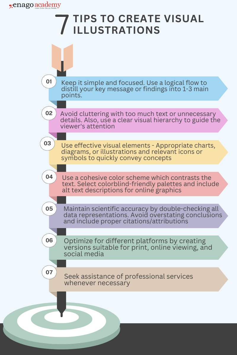
Best Practices for Using Visual Illustrations
As you embark on your next project, consider: How will you visually tell your research story? Will you craft a compelling GA to accompany your next paper? Or perhaps create an infographic to share your findings with the world? Here are some action points.
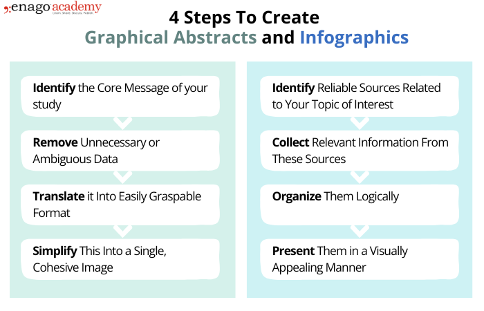
 As Sarah understood GAs, she realized it was like creating a movie poster for her research — a single, impactful image that captures the essence of her work. Mark, on the other hand, found that crafting an infographic was more akin to producing a short documentary, weaving together various data points and insights into a cohesive visual story.
Sarah and Mark’s approaches to their tasks differed significantly. Sarah focused on distilling her key findings into a single, powerful visual, while Mark found himself curating information from multiple sources to paint a broader picture.
Remember, in the end, it’s not just about the data – it’s about how you make that data speak to your audience. So go ahead, pick up that metaphorical paintbrush, and start visualizing your research. Who knows? Your next big breakthrough might just be a picture away.