A Deep Dive into Mastering Data Visualization Techniques and Design Principles


In 2023 alone, the world produced 120 zettabytes! Can you imagine that?!
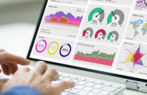
There is a need to make sense of this huge amount of data, and the best way to do that is through data visualization.
Data visualization turns raw, sophisticated data into a visual display that can help us see trends, progressions, and insights that may easily be overlooked.
The point why data visualization is effective lies in the fact that it tells a story and sometimes describes some insights that are embedded in the data, and those would not have been so obvious if they were presented in text format.
However, to create an effective data visualization is far more than just transforming numbers into graphs or charts; one needs to learn some more advanced techniques and design principles.
This article discusses all these advanced techniques and data visualization design principles. We will be excavating in detail these fancy visualization methods like heat maps, network diagrams, and treemaps visualizations in depth.
Let’s get right into it!
Basic Data Visualization Techniques
When discussing the basic definition, data visualization as a discipline forms the human work that bridges heavy datasets and human comprehension. This allows us to be able to see and understand data perceivably. On its lowest level of operation, this field relies on top-tier visualization methods that are well-pronounced in many other fields of study.
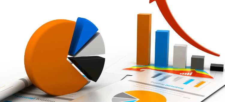
For example, the bar graphs are very effective in comparing quantities against many categories. Each set category is represented by a bar such that the length or height of the bar represents its value. This makes it very easy to compare values at a glance, hence bar graphs are best suitable for the representation of data like sales values for different regions or student grades on several subjects.
At the same time, pie charts work well in cases where some proportional parts or percentages contribute to the whole. Every slice of the pie represents a part, and its size is relative to the property it contributes to the sum. For example, it could be used to show how a population would be apportioned across age groupings in a pie chart or the market shares belonging to different brands in an industry.
When you are considering data visualization assets, you can also incorporate your branding elements into the visual assets create wider brand recognition.
Line graphs are normally good choices in the representation of changes over time such that there is a chance to analyze the trends. The x-axis mainly represents time, whereas the y-axis is used to represent the value of interest. Illustrations of stock market trends, website traffic, temperature changes, and many more find best in line graphs.
Fundamentally, which visualization tool you should use depends on your data and purpose you have in mind. Just getting a grip on when and how to use these basic techniques one can make clear and insightful visualizations that will improve our human experience of data.
Advanced-Data Visualization Techniques: Part I
Upon moving up the basic level of visualization techniques, one gets to see advanced and more complex methods that provide extended and detailed representation of information. Some of the complex visualization techniques involve heat maps and network diagrams.
Heat maps do an ultimate brief of a large amount of data and are visually catchy. All the variations in the intensity of color reflect the values of the data and one gets a full visual summary of information by only one look. For instance, in web analytics, heat maps may be used to display which parts of a webpage are getting the most focus.
The warmer colors confirm high activity which is represented by reds and oranges while cooler colors flow towards blue indicating low activity.
On the other hand, this form of visualization is also good for when there are correlations or patterns among different variables such as in genomic data or financial correlation matrices.
Contrarily, network diagrams, which are also called graph theory diagrams, are great for the representation of relational data. In our case, entities will be represented by nodes and edges used to connect such entities representing relationships between the same.
For instance, a general use of network diagrams is social network analysis whereby nodes represent people and the edges of their interaction with others. Other areas in which network diagrams can be used are telecommunications which shows the links between servers among other uses, biology to shows ecosystems or food webs, and transportation which shows routes and links.
Advanced-Data Visualization Techniques: Part II
Following are the other advanced data visualization techniques; treemaps, parallel coordinates, and geospatial visualizations that we will shed light on. Each technique we present here has the potential to creatively explain complex data sets to offer more illuminating visualizations.
Treemaps can be used best when hierarchical (tree-structured) data or part-to-whole relationships have to be visualized. The arrangement consists of nested rectangles representing levels of hierarchy, where the size of each rectangle depicts a particular dimension of data.
For instance, one may represent a treemap to show sales in a company categorized by the region of the sale, where regions are further divided into cities and the area corresponding to each city would be proportionate to the size of its contribution to the sales.
Parallel coordinates give one mode to portray high-dimensional multivariate data. Each variable is represented on one particular vertical axis, and the individual data points for variables will connect them with lines across those particular axes. Thus correlations and patterns in various variables can be seen that would not be evident or as easily viewed by other types of visualization techniques.
For instance, parallel coordinates offer a method to show the demographic data in which every axis indicates each variable (such as age, income, level of education, etc.) producing a very elementary and effortless contrast between the analyzed variables.
Geospatial visualizations use geographical data to display spatial relations or patterns that emerge. These may be in the form of heat maps, or point distributions superimposed over areas of a map.
For instance, a public health agency would use geospatial visualization for monitoring and tracking the course of an epidemic, wherein colors explain greater or lesser severity in different regions.
Data Visualization Design Principles: Simplicity and clarity
Simplicity and clarity are the two main aspects of data visualization design. Simplicity assists in reducing the complex view so that they do not turn out to be abstruse or overly complex to the viewer. Clarity ensures that the point is conveyed with little or no confusion at all.
Principally, it is aimed to keep it simple – don’t add too many decorative visuals and just focus on what is necessary to interpret the data. This may mean using a simpler chart type, removing additional colors or markers, or minimizing excessive gridlines and labels.
For example, with a clear color scheme and simple bar graph, the comparison of the quantities across categories is much better than having it confused by using a 3D complex pie chart. For every element of visualization, it has to have sense and contribute to understanding the data.
The colors need to be well used, the labels clear, and the scale well chosen. If for example, you are using line graphs to show trends over some time, the time scale must be the same, lines differentiated and they must have clear prefixes.
Data Visualization Design Principles: Consistency and accessibility
Inclusivity is necessary and so is consistency in data visualization. Consistency means that certain uniformity has to be there within the visualization such as color, typography, layout, and others. With this, users have a straightforward understanding of the visual language as they are naturally accustomed to looking at a screen in a certain way.
For instance, using colors similar to represent a category in different charts makes one recognize information faster.
Accessibility involves developing visualizations that could be used and understood by anybody, especially those people living with disabilities. This entails the effective use of color contrast, sufficient text alternatives for visual elements, as well as ensuring your visualization is pretty readable on several screen resolutions and sizes.
For example, a colorblind-friendly palette ensures high accessibility to individuals suffering from color vision deficiency.
Advanced Tools and Software for Data Visualization
The field of data visualization has many sophisticated visualizations that are made possible by the advanced tools and software that characterize it. These include Tableau and D3.js among others.
Tableau is one of the existing leading business intelligence as well as data visualization tools. What makes it very user-friendly is the fact that one can create complicated visualizations through dragging and dropping on its interface without necessarily depending on extensive programming skills. It is also able to support a wide range of sources starting from a simple Excel spreadsheet to the cloud-based databases.
However, despite its power, Tableau can also come at quite an expense, particularly to the small business or individual who would want to use it.
When it comes to D3.js, is a JavaScript library for data visualization and manipulation of documents based on data. Few tools offer such flexibility and control, allowing the user to create any kind of visualization that he can dream up with this free and open-source tool. Although it requires prior knowledge of JavaScript and web standards. Its learning curve is steep though.
Both Tableau and D3.js have their advantages and drawbacks. Which one to select would depend on your requirements, resource availability, and skill set. In general, Tableau may be more relevant for non-programmers or users needing to create high-quality visualizations very quickly while developers seeking the utmost control and customization may be fond of D3.js.
Conclusion
Looking ahead, emerging trends like immersive VR and AR visualizations, predictive analytics, and AI-driven automatic visualization as well as real-time interactive visualizations are likely to further disrupt the space. Put in other words, these transformations too bring in their set of challenges.
However, this will require a lot of effort and innovation in providing clear, accurate, technologically impressive, ethical visualizations, as well as making sure all users have equal access to the same.
It will be important that as we traverse through this exciting terrain, we further sharpen our understanding of the convoluted science of data visualization.