Why is Data Visualization Important in Academic Research?

Data sets are sometimes hard to understand. Data analysis and data modeling can be complicated, but there are likely better ways to visualize your data. So, what is data visualization? Simply put, it is a way to represent data that allows people to understand data more easily. There are many tools available for researchers to perform a variety of tasks related to data visualization, including exploring the literature, finding and sharing data and code, connecting with others, processing data, writing, publishing, and evaluating research.
Ultimately, the goal of data visualization is to communicate data, make sense of it, and express its relationship to other data. The presentation and visualization of various types of data require thoughtful data management and careful use of colors. Read on to understand how data visualization can help researchers in academia!
Data Visualization for Academics
Data visualization is a way of representing data that allows its meaning to be communicated clearly. One must consider to choose visualization parameters appropriately, using color only for critical data points, and keep axes/gridlines in grayscale. It is important to consider the purpose of data visualization (either communication or analysis).
One type of data visualization is Open Knowledge Maps, which helps people visualize articles (28 million) within a particular research area. These Open Knowledge Maps identify themes, findings, major points of articles, and subsequently creates diagrams showing relationships between these articles.
As one can imagine from this example, academia benefits from data visualization for many reasons. It facilitates theory refining, uncovers holes in data sets, and supports model development. It also summarizes data-supported conclusions, promotes online sharing, and becomes a method by which scientists can advocate for policy changes.
How Data Visualization Helps
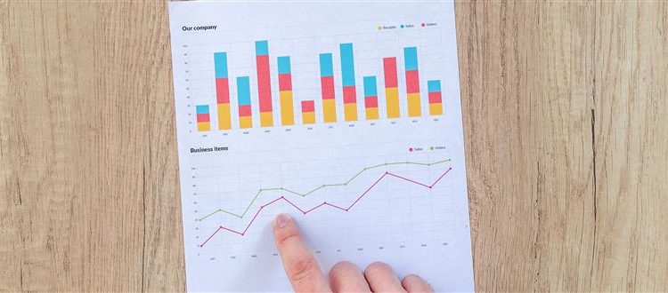
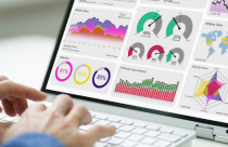
Colors, organization, tables, and plots, can all facilitate the understanding of data and their context. When used effectively, these artistic considerations can greatly improve reader comprehension of important or expansive data sets.
In this way, properly developed visuals reduce information to most important points while excluding unnecessary information (i.e., “chartjunk”). Furthermore, data visualization can allow for the identification of patterns within larger data sets, facilitate comprehension of the point faster, and quickly communicate stories and narratives associated with research. These latter points are particularly useful considering the social and policy implications of some research. For example, an infographic on CO2 emissions and rising climate temperatures would clearly indicate the urgency of addressing the role of humans in global climate change. As illustrated by this example, data visualization is particularly useful for multivariate data, numeric data with a broad range, geographic data, and large texts or spreadsheets.
Available Tools for Data Visualization
There are many tools available to promote the rapid visualization of data. These tools include infographics, such as Visme, which is a user-friendly tool for infographics, presentations, charts/graphs, or animations. Additionally, temporal relationships can be demonstrated using timelines, such as Tiki-Toki, which combines multimedia with a timeline.
Meanwhile, word clouds can identify a popular topic. These are easily constructed with tools, such as Tagul. This is a tool for importing text on a website so that it can be converted into a word cloud. Commonly observed data visualization tools include those that create charts and graphs, such as Many Eyes, which is an IBM tool developed to help scientists create a variety of data visualizations.
Ultimately, scientists can use the Java programming language to create a data visualization tool that is most appropriate for their data! So, if you’re going about data analysis or data modeling and want to make understanding your data easy, consider using these tips for data visualization! Your readers will benefit from an improved understanding of your research, while you benefit from greater exposure as a scientist.


Very useful information.